CLIENT

CP Training Solutions

SERVICES RENDERED

Wireframe, Visual Design, Web Design, Social Media, Branding

DATE COMPLETED

May 2020

CP Training Solutions, led by Peter, is one of the UK’s foremost providers of face-to-face healthcare safety training. With a strong reputation for reliable and efficient training delivery, the company needed a digital presence that matched its professionalism and authority within the healthcare sector.

Peter approached me to modernise and elevate the brand not just visually, but strategically ensuring the business looked as credible online as it is in practice.

The existing brand and website had become outdated and no longer reflected the quality or scale of the training services offered. The key challenges were:

  • - An ageing website with limited visual impact and outdated UX
  • - A brand identity that lacked cohesion and modern appeal
  • - No strong social media presence to support growth
  • - Marketing assets that felt inconsistent and disconnected

The goal was clear: reposition CP Training Solutions as a modern, trustworthy, and leading healthcare training provider in the UK.

I began by understanding the needs of both primary user groups: church members and first-time visitors. From there, I focused on creating a clear information hierarchy and an intuitive navigation structure. My process included:

  • - Defining key user journeys (new visitors, returning members, media viewers)
  • - Designing a calm, approachable visual identity aligned with Adventist branding
  • - Creating responsive layouts to ensure accessibility on all devices
  • - Structuring content around real user needs: beliefs, ministries, media, and contact
  • - Integrating live streaming and media galleries for remote worship
  • - Designing a logo refresh and cohesive brand styling across the site

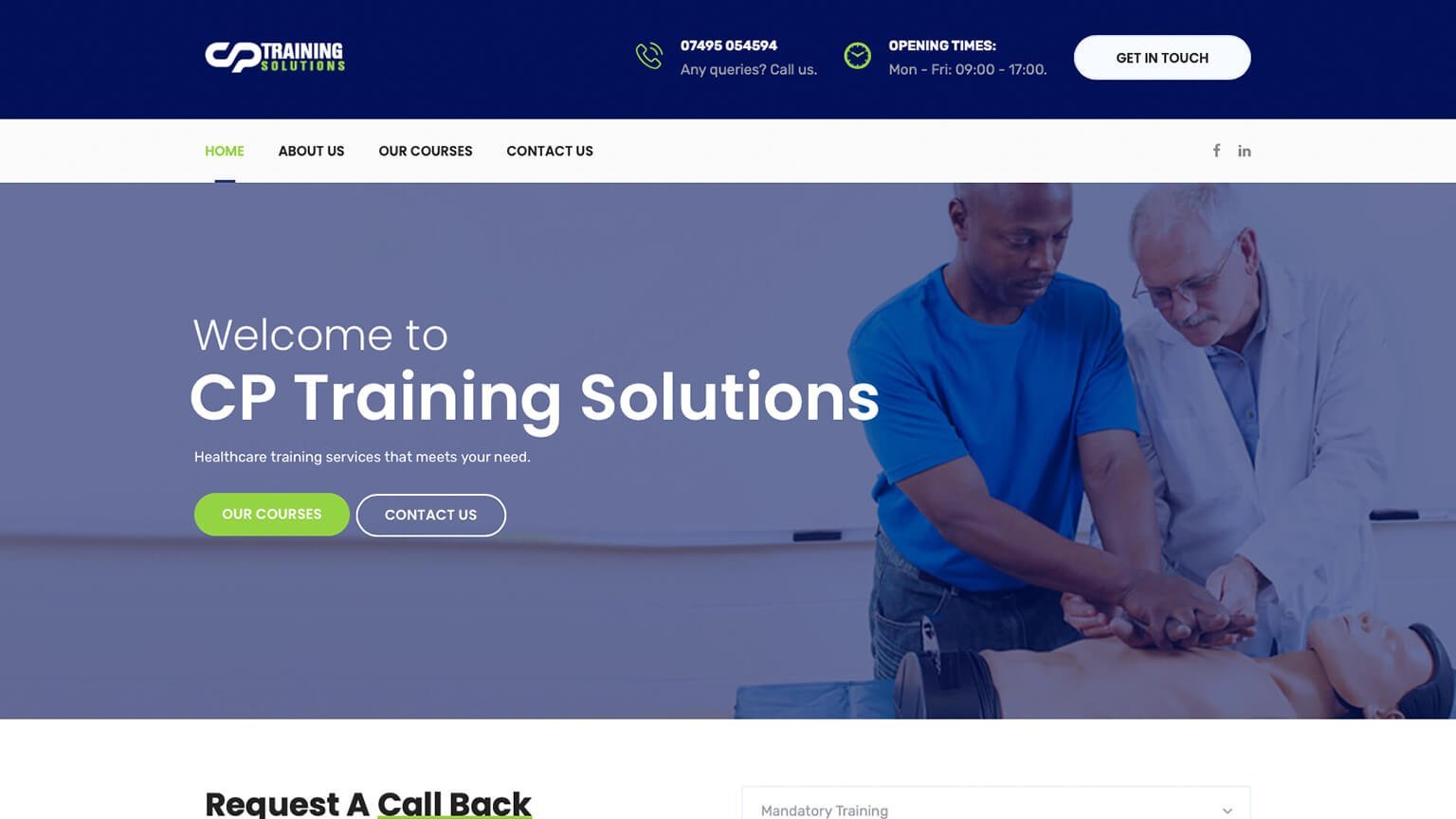
The design leaned heavily into clarity, simplicity, and accessibility — ensuring that anyone, regardless of age or technical ability, could comfortably navigate the platform.

  • - A modern, cohesive brand identity
  • - A professional and user-friendly website
  • - Improved clarity of services and value proposition
  • - Stronger credibility within the healthcare training market
  • - A scalable brand foundation for future growth

The transformation elevated CP Training Solutions from an ageing brand to a polished, authoritative industry presence.

What I Delivered

  • - Full brand redesign (logo, colour palette, typography)
  • - Stationery design (business cards, letterheads)
  • - Social media branding assets
  • - Website redesign (UX/UI + responsive development)
  • - Structured content layout for improved conversion
  • - End-to-end brand consistency across digital touchpoints

Tools Used

A list of tools used in this project

  • img Visual Studio Code
  • img HTML & CSS
  • img WordPress
  • img JavaScript
  • img Adobe Illustrator
  • img Adobe Photoshop

Colour Palette

A list of colours used in this project

Primary

#111C55

Secondary

#02115A

Accent

#95D343

Text

#222222

Background

#F7FAFF

© ALLEN CHIGODO 2012 - 2026. ALL RIGHTS RESERVED.